Anorexia

(Click to Enlarge)
I really like this picture, because of the textures that can be seen on the body, the only reason I did not like this image too much was due to the lighting, where its flashed very brightly on the model at the front. However, I do like the harsh shadows that have been casted on her by her own body.

C. Stevenson
Here is the main artist image i got this inspiration from and created my research on.

(click to enlarge)
In this image, I have shown my model in black and white. I experimented with saturation when creating the mini slide show film (shown below), and I realised that the more saturated an image was, the more life-full it looked. The less saturation there was, the more life-less and dead it looked. I wanted my model to look lifeless because being anorexic, the insides of her would get damaged, which means she is slowly loosing her life even though she does not know it. I used the measuring tape as a weapon in this image. I used it as a metaphor to represent how the competition to be thin can affect the human body in bad ways. The tape, or in this case the weapon, is in colour, this is to set a sense that it is dominating over her.
On the left, I have created a movie to show the progress of of a girl becoming thinner every time. I made this into a movie slideshow, because it shows a sense of time progression, and the effort girls put in to become something else. This was put together from a research where I asked girls how much effort girls put into their looks, most girls replied with the answer "A lot".
The girl turning from her natural figure, to someone she wants to be. I made the saturation get lesser, because it shows the freshness and life inside her body slowly dying away. Her clothes and the tape stays its natural colour, because they are her assets, the are more real than the body itself.
The girl turning from her natural figure, to someone she wants to be. I made the saturation get lesser, because it shows the freshness and life inside her body slowly dying away. Her clothes and the tape stays its natural colour, because they are her assets, the are more real than the body itself.

(click to enlarge)
Here I have done some experimentation with body posture and some effects on Adobe Photoshop.
- Top left corner is a plastic wrap effect, this looks very effective because it gives a sense of plastic and fakeness to the image, it also makes it look laminated, which shows that she wants to maintain herself to look like this.
- Top middle picture is cut out filter. This filter has created many harsh shadows on the models body, however it lacks in detail, and the image doesn't seem to be as effective.
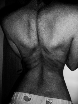
- Top right image shows the back of the model, here I have simple made the picture black and white, making the reds in the image much darker, then also adjusting the contrast to make it high. I think this has given me a very good effect, because the harsh shadows and outlines in the body can be seen very clearly, making her look quite horrific.
- Bottom left picture is diffuse glow filter on the girls body. I really liked this effect, however, it does not make the girl look harsh and striking, instead it makes it look more glamourous in some parts. I like this effect because the glow makes the less important parts of this image such as the hand, and the chest very bright, so the viewer can focus on the dents and darker areas that get highlighted.
- The last picture on the bottom right is the water pencil filter. This filter makes the image quite blurry, which is why I did not like it so much. It was my least favourite effect as it did not do the job as well as the 1st or the 3rd image.
