EXPERIMENTATION
CROPPING
Cropping is a good way of artificially filling the frame, it also allows the photographer to take out any negetive space they feel is making the image look bad.
Throughout my experimentation, I have used this technique when I felt like the picture was weak in its original state.
Throughout my experimentation, I have used this technique when I felt like the picture was weak in its original state.
#1: Consider Black and White
Consider using your digital camera's grayscale mode for sharp, artistic looking photographs.
When taking pictures, you may want to take a couple in black-and-white or grayscale mode for experimentation. Doing that may add artistic edginess to your photos, and I've found landscape or city skylines to be perfect subjects for such photo experiments.
Or, most photo manipulation software support a "Convert to grayscale" mode. If you don't like the results for a particular photo, try adding more contrast to a photo after its conversion. This can make some photos look more dramatic.
When making things black and white, I realised how to me all the black and white photographs look like they represent man made things such as the dominating figure.
When in colour, the nature looks more dominating. This experimentation is demonstrated below.
When in colour, the nature looks more dominating. This experimentation is demonstrated below.
Black and White

(Click to Enlarge)
Experiment
I think that the colour picture makes the image look like nature is more dominating over man made.
This is due to the detail in the moss and its green colour. There is almost no grey showing from the stone, as the colour of the nature is much more vibrant, and fills the frame. On the other hand the lots of grey in the other picture gives us a concrete feel to the picture, which is man made.
In these pictures I used the colour balance to make the greens and reds stand out more, I also changed the brightness and contrasts. For the Black and White picture I only used desaturation and brightness&Contrast.
Colours Enhanced

(Click to Enlarge)
Original

(Click to Enlarge)
The macro shot also helps achieve this effect, as it is very close up of the moss and plants growing off the concrete wall. I think however, the picture could be improved by showing the concrete walls a bit too, as the picture is very unclear of what its trying to represent.
Colours Enhanced

(Click to Enlarge)
Personal Opinion
Here I Have noticed how again when the colour gets taken out, the textures in the bricks become more noticeable and harsh, making the picture seem man made dominating.
On the other hand, the green in contrast with the red bricks makes the picture very easy to look at. Even though the colours and textures still seem harsh, the picture seems to look soft, due to the green clashing with red.
The colourful image makes it seem like Nature is taking over Man Made.
I have also changed the orientation of this image by rotating it by 90 degrees clockwise.
Black and White

(Click to Enlarge)
Original Image

(Click to Enlarge)
#2: Colours and Moods
Can color affect a viewer's mood?
When composing digital photos, consider if the colors of your subject(s) will have an emotional impact on the viewer. For example:
* Blues - openness, calmness
* Similar colors, such as greens and yellows - harmony, peace of nature
* Contrasting colors, such as reds or yellow - jarring, conflict
* Black and white - stark, moody, dramatic

(Click to Enlarge)
I thought about Pop art, because the concept of it is to remove the material from its context and isolate the object, or combine it with other objects, for contemplation. The concept of pop art refers not as much to the art itself as to the attitudes that led to it.
I wanted to experiment by making the work very simple, and make nature, and its beauty stand out. Repetition of the same object gives a sense of standing out.
This lead me to Andy Warhol a very famous pop artist.
I wanted to experiment by making the work very simple, and make nature, and its beauty stand out. Repetition of the same object gives a sense of standing out.
This lead me to Andy Warhol a very famous pop artist.
Personal Opinion
Autumn leaf in the style of pop-art. The colours are interesting, it brings the concept of colour palette out. It is linked to how black and white is more man made, and colourful is more nature. I thought about making this experiment quite dramatic, by using bright colliding colours in the colour wheel. I desaturated the background, to get rid of the blue feel to the concrete.By doing this I think i've achieved a very attractive picture, that sums up the second part of my question "What is more creative?"I have taken the idea of creatively manipulating the image, and using it as a visual metaphor to evaluate the question.
Original Image

(Click to Enlarge)
Experimentation

(Click to Enlarge)
Here is the manipulated version of the picture on your right. For experimentation, I firstly solarised parts of this picture, I then changed its colour through colour balance and played around with curves on Photoshop. I also cropped this picture to make it fill the frame, and make it centre of attention.
I think this is very effective and looks quite different and attractive compared to the original picture on the right.
I think this is very effective and looks quite different and attractive compared to the original picture on the right.
Original Image

(Click to Enlarge)
Here I have a picture of the cross, colour balanced in two different ways. I changed the contrast between the clouds and the cross itself.
Experiment 1
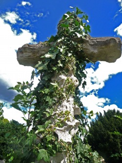
Here i have made the clouds look very vibrant, and almost fake, this is by putting more cyan into the colour balance. It seems like I have also altered the green in this picture by adding a bit of yellow into the pictures.
I think this effect shows nature as the more dominant feature in this photograph.
The fact that the image is taken at a low angle supports the idea of dominance in this picture.
I think this effect shows nature as the more dominant feature in this photograph.
The fact that the image is taken at a low angle supports the idea of dominance in this picture.
Experiment 2
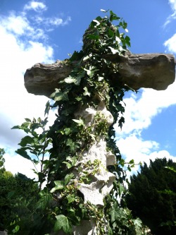
In this photograph, the clouds have been put into an auto level, whilst on the other hand, the cross has been given a higher contrast. The greenery in this scene has also been given a high contrast, this is so that the colours do not take over the image.
By looking at this picture, I feel that it creates the opposite effect to what the picture on the left does. This picture has more sedepth in it, and makes us feel as if the man made structure, the cross is more dominant.
By looking at this picture, I feel that it creates the opposite effect to what the picture on the left does. This picture has more sedepth in it, and makes us feel as if the man made structure, the cross is more dominant.
I thought the overall idea of this image was quite good, I really liked the low angle shot to represent the key word being dominance in this picture. However, I think the quality of this shot is quite low and could be re-took to frame things better.
To conclude I feel that colours do make a difference, and change the idea of a picture. This is especially shown in the pictures with a cross.
#3 : Take photos at a different time
Take advantage of the lighting available outside at different times of the day for great photographs with your digital camera.
Want to turn a bland photograph into something amazing? taking the digital camera photographs at different times of the day. A normal landscape shot like that you've seen thousands of other photographers take can look much more memorable if taken at dawn or at dusk. Granted, low light conditions may require some experimentation with exposure time, ISO sensitivity, and some shots may require a tripod, but the results should be worth the trouble.
